Histograms
The histogram panel is one of Graphistry's most insightful, convenient, and powerful tools. Though it might be non-obvious at first, it quickly becomes a mainstay. With it, you can create a histogram for any attribute of the elements in your graph, and use it to quickly understand that data and then manipulate the rest of the system using it. Let's look at an example…
Create a Histogram
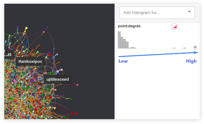
A histogram provides a look at how any attribute of the elements in a graph is distributed.
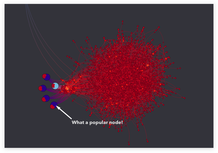
For instance, to understand the point:degree values, we first add a histogram of it by using the dropdown. The dropdown adds a chart that represents all the nodes in the graph binned by their degree. In the example, the chart shows many nodes have low connectivity, and only a few nodes have a high level of connectivity.
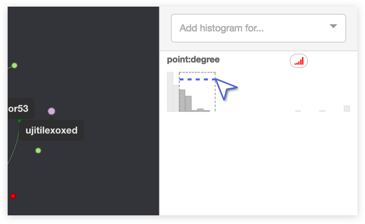
Select A Range To Create Filters
You can filter the graph on-the-fly by manipulating a histogram. Simply click one of the bins, or click and drag across multiple bins. The visualization will pare down to nodes with attributes within that range. Click the selected bin range again to delete the filter.
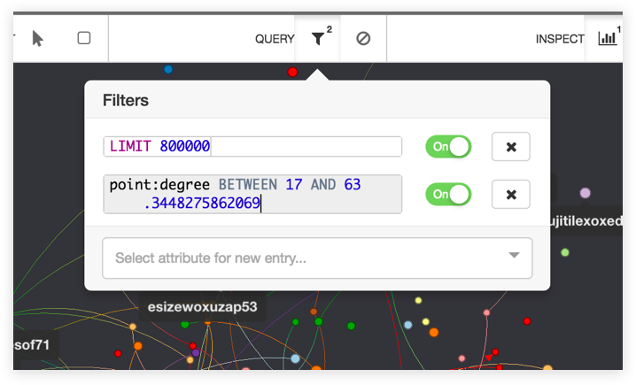
We Just Created a Cool Filter!
The filter panel is a convenient place to see and manipulate the set of active filters in detail, and includes the filters created through the histogram panel.
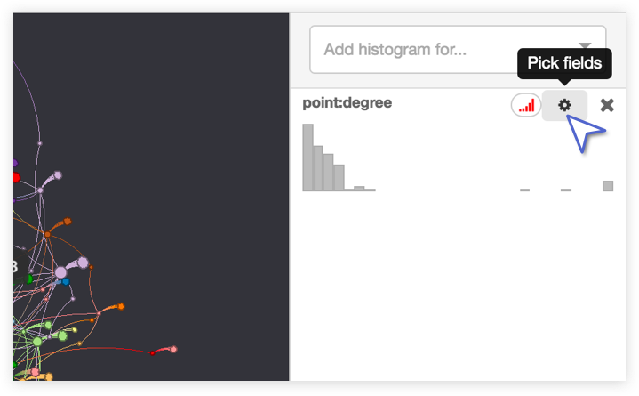
Histogram Settings Control the Graph
Lets jump into this histograms’ advanced settings, so we can apply a color scheme for our graph.
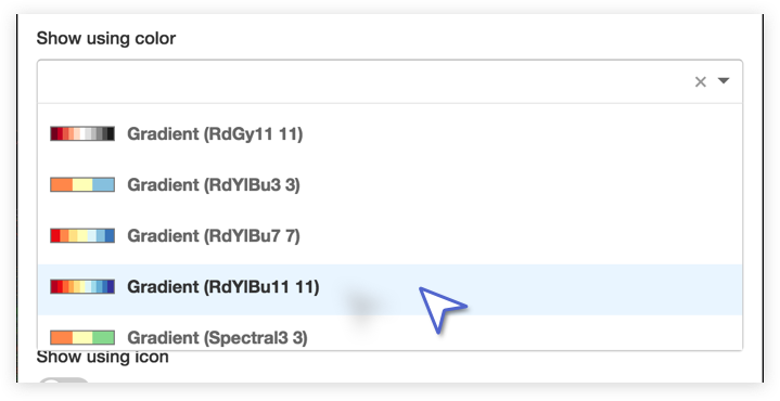
Applying a Color Profile
Say we wanted to be able to see from far away which elements in our graph have the most connections? In our histogram settings, we can select a gradient color scheme, and now we can see our highly connected nodes in red, and our low connectivity nodes in blue.
- Gradient palettes: Values are interpolated by blending nearby palette colors, similar to a heatmap. Pick when you want to compare numeric values, such as for the earliest time, or the biggest size.
- Categorical palettes: Values are assigned exact palette colors in a round-robin order. Pick when you want to compare distinct things, such as different kinds of alerts or communities.
Result
We just used a histogram to apply a custom color scheme to an attribute we we’re interested in. Try playing with some different attribute histograms!
Looking for more information?
Browse our in-depth UI guide slideshow to take you through all the details of the Graphistry tool suite.